

Table of contents
Typography
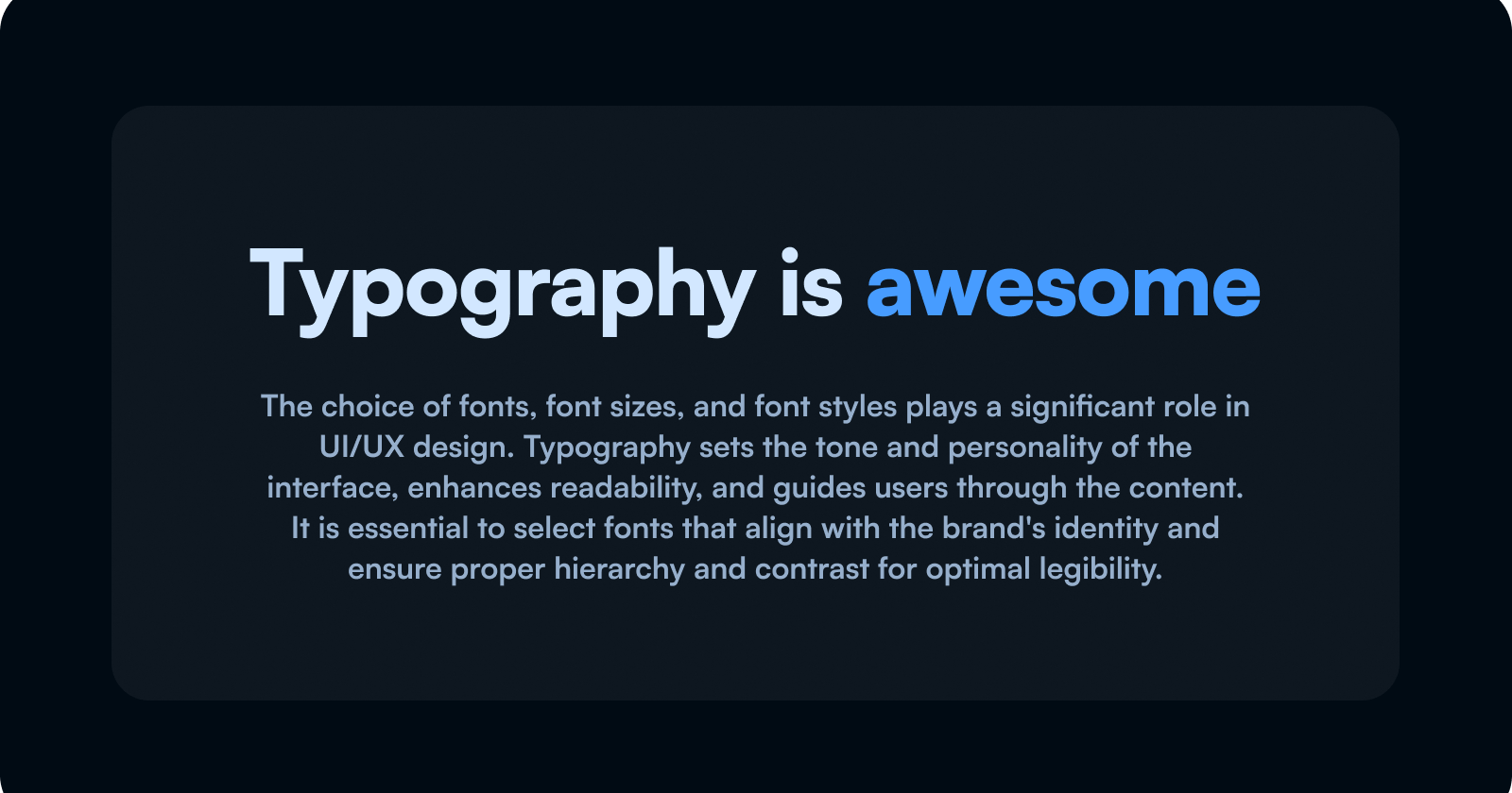
The choice of fonts, font sizes, and font styles plays a significant role in UI/UX design. Typography sets the tone and personality of the interface, enhances readability, and guides users through the content. It is essential to select fonts that align with the brand's identity and ensure proper hierarchy and contrast for optimal legibility.
Hack 1
Line height refers to the space between text lines and is crucial for achieving good design. By examining the websites of well-known companies, you'll notice that their headings tend to have similar line heights. It's important to note that as the heading size increases, the line height generally decreases. To enhance your designs with line height, I recommend using a range of 1.1 to 1.3 times the size for headings and 1.3 to 1.5 times the size for body text. Another simple improvement to elevate your designs is adjusting the letter spacing.
Hack 2
Letter spacing refers to the distance between characters in your text. While it may not seem significant, it can make a big difference in the appearance of your content.
You may have noticed that headings with crispness often use negative letter spacing. You might wonder why fonts don't come with negative letter spacing by default if it looks so good.
The simple answer is that negative letter spacing is typically reserved for headings. If you use it too much in your body text, you will quickly notice a decrease in overall readability. This also applies to headings, but the impact is less noticeable due to their larger size.
As a general rule, when it comes to letter spacing for text, I typically use somewhere around -1% to -2% for headings. If it looks too tight and you're unsure, a lower number is usually the better choice. Now, let's move on to text alignment.
Hack 3
Using center alignment for long paragraphs can cause significant problems in your designs. When reading a long paragraph that is center-aligned, it takes longer to process the information because you constantly have to find the beginning of each line. This decreases your reading speed as you spend time locating the next line instead of reading.
However, center-aligned text is acceptable and commonly used for headings and shorter text chunks. Many big companies and visually appealing websites utilize center alignment for these purposes.
One thing you should never do is mix center-aligned headings with left-aligned body text (or vice versa). Avoid this practice at all costs.
A general rule of thumb is to use left alignment for anything that spans more than three lines of text. Additionally, as mentioned earlier, do not mix and match alignments between headings and body text.
Hack 4
The next point is about text width in a UX study conducted by The Baymard Institute. It was revealed that long lines of text are typically perceived by users as intimidating and overwhelming. As a result, users are more likely to avoid reading the text.
Users avoiding to read the text is not a good thing. The Baymard Institute also concludes that more users will fail to fully understand the benefits of products or services, and thus decide that a particular product or service won't meet their needs.
So, not only will long lines of text discourage users from reading, but they will also lead to fewer conversions. This may not mean a lot to you right now if you're just focused on designing good-looking stuff. However, let me put it like this:
fewer conversions equal less money, which in turn leads to unhappy clients and stakeholders. No matter how good the design looks, it's important to consider the impact on conversions.
Now, you may be wondering, what is a good text width? Well, this is not just my own opinion, but a recommendation from The Baymard Institute. They suggest that anywhere between 50 to 75 characters is a good range to stay within for your body text.
For a normal paragraph, aiming for around 18 pixels and staying within 50 to 75 characters is ideal. When it comes to pixel width, 600 pixels for a desktop screen is a very good number to stick with.
Source: https://baymard.com/blog/line-length-readability
Hack 5
Now let's talk about hierarchy in text. A common mistake is to overuse text sizes to indicate hierarchy in your designs. This will quickly make your designs look messy, random, and unprofessional.
Like most things in design, less is usually more. Fortunately, we have a rather easy solution to this problem. So, the next time you're designing something, try your absolute hardest to stick with just two different font sizes. Use font weight and subtle color changes to indicate hierarchy.
Hack 6
Next up is spacing related to text elements. Space is one of the most neglected aspects of design for new designers. About this, I found a really good quote by Jan Tschichold:
"White space is to be regarded as an active element, not a passive background."
So, white space or space should be as carefully considered as your images, buttons, or flashy animations. It should be even more considered than those things.
Now, there is a very practical way of approaching this when designing, and I call it "relationship advice" in UI design. If you have a group of elements and you ask yourself, "What's their relationship?", you'll quickly notice that some elements have a closer relationship than others. Let me give you a practical example.

In this group of text elements, the bottom heading is more closely related to the body text below than it is to the body text above because it's the heading for the text below and not the text above.
So, This would tell us that since the bottom heading and the body text have a closer relationship, they should also be positioned closer to each other. To make it simple, let's use a multiplier for this relationship. If the distance between the bottom heading and the bottom body is x (16 pixels), the distance between the bottom heading and the top body should be 2x (32 pixels). This same rule can be applied to a lot of things in your UI, such as distances between call-to-action elements and hero texts, logos and links in navigation menus, etc.
Conclusion
In conclusion, Typography is a powerful tool in UI/UX design, influencing the overall look, readability, and user experience of a digital interface. The presented hacks offer valuable insights for designers looking to enhance their typographic choices:
Line Height and Letter Spacing: Adjusting line height and letter spacing can significantly improve the overall design, with recommended ranges for headings and body text.
Text Alignment: Careful consideration of text alignment is crucial. Center alignment is suitable for headings and shorter text chunks, but long paragraphs should be left-aligned to maintain optimal readability.
Text Width: The Baymard Institute suggests an ideal range of 50 to 75 characters for body text, promoting better readability and user engagement. Designers should be mindful of text width to avoid overwhelming users and impacting conversions.
Hierarchy: Establishing a hierarchy with font sizes is important, but overuse can lead to a cluttered and unprofessional appearance. Designers are encouraged to use only two font sizes and rely on font-weight and subtle color changes for hierarchy.
Spacing: White space is an active element in design, influencing the relationships between different text elements. The "relationship advice" approach emphasizes the importance of considering the spacing between elements based on their relationship, enhancing overall visual harmony.
By implementing these typography hacks, designers can create visually appealing, readable, and user-friendly interfaces that contribute to a positive user experience. Understanding the nuances of typography is essential for crafting designs that not only look good but also effectively convey information to users.